Bootstrap 3 was like the iPhone 5 of front-end frameworks — a sleek upgrade that refined the experience while staying familiar. It wasn’t a radical overhaul, but a thoughtful evolution, polishing the rough edges and adding new features that made building responsive websites even smoother. It was the moment Bootstrap truly matured, becoming a go-to tool for web developers seeking a balance between flexibility and ease of use.

Introducing Bootstrap
- Free, fast, and easy web development with Bootstrap’s front-end framework
- Bootstrap provides pre-built HTML and CSS components for typography, forms, buttons, tables, and navigation..
- Bootstrap enables the simple creation of responsive layouts.
What Makes a Website Responsive?
With responsive web design, websites automatically adjust their layout to fit perfectly on any device, from smartphones to large desktop monitors.
Bootstrap Sample
<div class="jumbotron text-center">
  <h1>My First Bootstrap Page</h1>
  <p>Resize this responsive page to see the effect!</p>
</div>

<div class="container">
  <div class="row">
    <div class="col-sm-4">
      <h3>Column 1</h3>
      <p>Lorem ipsum dolor..</p>
    </div>
    <div class="col-sm-4">
      <h3>Column 2</h3>
      <p>Lorem ipsum dolor..</p>
    </div>
    <div class="col-sm-4">
      <h3>Column 3</h3>
      <p>Lorem ipsum dolor..</p>
    </div>
  </div>
</div>
Bootstrap’s Origins
Mark Otto and Jacob Thornton created Bootstrap at Twitter, and in August 2011, it was made publicly available on GitHub as an open source project.
Bootstrap was the top project on GitHub in June 2014!
Advantages of Bootstrap
- Simple to use: Anyone may begin using Bootstrap with only rudimentary HTML and CSS expertise.
- Features that are responsive: Bootstrap’s responsive CSS adapts to PCs, tablets, and smartphones.
- Mobile-first strategy: The basic framework of Bootstrap 3 includes mobile-first styles.
- Browser compatibility: Chrome, Firefox, Internet Explorer, Edge, Safari, and Opera are all current browsers that Bootstrap works with.
Bootstrap Version History
Bootstrap 3 was launched in 2013, and this tutorial comes after that. But we also go over more recent iterations, such Bootstrap 4 (which came out in 2018) and Bootstrap 5 (which came out in 2021).
The most recent version of Bootstrap, known as Bootstrap 5, has additional components, quicker stylesheets, increased responsiveness, and more. It works with the most recent, reliable versions of every major platform and browser. Internet Explorer versions 11 and lower, however, are not supported.
The primary distinction between Bootstrap 5 and Bootstrap 3 and 4 is that the former has shifted from jQuery to JavaScript.
Note: It is completely safe to keep using Bootstrap 3 and Bootstrap 4 as the team continues to support them for important bug fixes and documentation updates. They won’t, however, get any new features.
How Can I Find Bootstrap?
You may use Bootstrap on your own website in two different ways..
You could:
- Bootstrap can be downloaded from getbootstrap.com.
- Use a CDN to include Bootstrap.
Obtaining Bootstrap
Go to getbootstrap.com and follow the directions there if you wish to download and host Bootstrap yourself.
Bootstrap CDN Integration
You can incorporate Bootstrap from a CDN (Content Delivery Network) if you don’t want to download and host it yourself.
MaxCDN offers CDN support for JavaScript and CSS in Bootstrap. Additionally, you need to incorporate jQuery:
<!-- Latest compiled and minified CSS -->
<link rel="stylesheet" href="https://maxcdn.bootstrapcdn.com/bootstrap/3.4.1/css/bootstrap.min.css">

<!-- jQuery library -->
<script src="https://ajax.googleapis.com/ajax/libs/jquery/3.7.1/jquery.min.js"></script>

<!-- Latest compiled JavaScript -->
<script src="https://maxcdn.bootstrapcdn.com/bootstrap/3.4.1/js/bootstrap.min.js"></script>
A Bootstrap CDN Advantage
When browsing another website, many people have already downloaded Bootstrap from MaxCDN. When users visit your website, it will therefore be loaded from cache, resulting in a quicker loading time. Additionally, the majority of CDNs ensure that a user’s file requests are fulfilled by the server that is closest to them, which speeds up loading times.
jQuery
For JavaScript plugins (such as tooltips and modals), Bootstrap leverages jQuery. However, jQuery is not required if you only use the CSS portion of Bootstrap.
Building Your First Bootstrap Web Page
1. Include the doctype for HTML5.
The HTML5 doctype is necessary for the use of HTML elements and CSS properties in Bootstrap.
The HTML5 doctype, the lang attribute, and the appropriate character set should always be included at the start of the page:
<!DOCTYPE html>
<html lang="en">
  <head>
    <meta charset="utf-8">
  </head>
</html>
2. Bootstrap 3 prioritizes mobile devices.
Mobile device responsiveness is a key component of Bootstrap 3. A component of the core framework is mobile-first styles.
For optimal rendering and touch zooming, include this <meta> tag within the <head>
<meta name="viewport" content="width=device-width, initial-scale=1">The width of the page is set to match the device’s screen width (which varies based on the device) via the width=device-width section.
When the browser first loads the page, the initial-scale=1 section determines the initial zoom level.
3. Containers
In order to surround the contents of a website, Bootstrap additionally needs a contained element.
There are two sorts of containers available:
- A responsive fixed width container is offered by the
.containerclass. - A full width container that fills the viewport’s width is provided by the
.container-fluidclass.

Two Fundamental Bootstrap Pages:
The code for a simple Bootstrap page with a responsive fixed width container is displayed in the example below:
For instance
<!DOCTYPE html>
<html lang="en">
<head>
  <title>Bootstrap Example</title>
  <meta charset="utf-8">
  <meta name="viewport" content="width=device-width, initial-scale=1">
  <link rel="stylesheet" href="https://maxcdn.bootstrapcdn.com/bootstrap/3.4.1/css/bootstrap.min.css">
  <script src="https://ajax.googleapis.com/ajax/libs/jquery/3.7.1/jquery.min.js"></script>
  <script src="https://maxcdn.bootstrapcdn.com/bootstrap/3.4.1/js/bootstrap.min.js"></script>
</head>
<body>

<div class="container">
  <h1>My First Bootstrap Page</h1>
  <p>This is some text.</p>
</div>

</body>
</html>
The code for a simple Bootstrap page (with a full width container) is displayed in the example below:
<!DOCTYPE html>
<html lang="en">
<head>
  <title>Bootstrap Example</title>
  <meta charset="utf-8">
  <meta name="viewport" content="width=device-width, initial-scale=1">
  <link rel="stylesheet" href="https://maxcdn.bootstrapcdn.com/bootstrap/3.4.1/css/bootstrap.min.css">
  <script src="https://ajax.googleapis.com/ajax/libs/jquery/3.7.1/jquery.min.js"></script>
  <script src="https://maxcdn.bootstrapcdn.com/bootstrap/3.4.1/js/bootstrap.min.js"></script>
</head>
<body>

<div class="container-fluid">
  <h1>My First Bootstrap Page</h1>
  <p>This is some text.</p>
</div>

</body>
</html>
The Bootstrap Grid System
A page can have up to 12 columns thanks to Bootstrap’s grid framework.
You can build broader columns by grouping the 12 columns together if you don’t want to utilize them all separately:
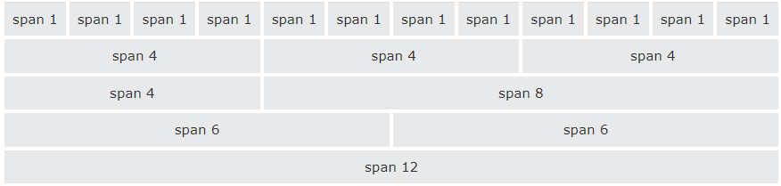
Because of Bootstrap’s responsive grid architecture, the columns will automatically adjust to the screen size.
Bootstrap Grid Classes
There are four classes in the Bootstrap grid system:
xs(phones with screens smaller than 768 pixels)sm(for tablets, screens that are at least 768 pixels wide)md(for laptops with screens that are at least 992 pixels wide)lg(screens that are at least 1200 pixels wide for laptops and desktop computers)
Combining the previously described classes can result in layouts that are more flexible and dynamic.
Essential Bootstrap Grid Structure
A Bootstrap grid’s basic structure is as follows:
<div class="row">
  <div class="col-*-*"></div>
  <div class="col-*-*"></div>
</div>
<div class="row">
  <div class="col-*-*"></div>
  <div class="col-*-*"></div>
  <div class="col-*-*"></div>
</div>
<div class="row">
  ...
</div>
Make a row first (<div class="row">). Next, include as many columns as you want (tags with the proper .col-*-* classes). Keep in mind that each row’s numbers in .col-**- should always add up to 12.
We have gathered a few basic Bootstrap grid layout examples below.
Three Evenly Spaced Columns

The example that follows demonstrates how to create three columns of identical width that scale from tablets to huge desktops. The columns will stack automatically on mobile devices or displays smaller than 768 pixels:
<div class="row">
  <div class="col-sm-4">.col-sm-4</div>
  <div class="col-sm-4">.col-sm-4</div>
  <div class="col-sm-4">.col-sm-4</div>
</div>
Unequal Two-Column Grid

The example that follows demonstrates how to obtain two columns of varying widths that scale to huge desktops from tablets:
<div class="row">
  <div class="col-sm-4">.col-sm-4</div>
  <div class="col-sm-8">.col-sm-8</div>
</div>