In reality, styling specified in App.vue or within the <style> tag in a component is accessible globally in all components.
The scope attribute on the component can be used to keep the styling local to that component: <style scope>

Universal Styling
Any *.vue file that has CSS inside the <style> tag is globally accessible.
This implies that if we, for instance, modify the background color of <p> tags in one *.vue file to pink inside the <style> tag, this will impact <p> tags in every *.vue file in that project.
Example
This application consists of two components, CompOne.vue and CompTwo.vue, and three *.vue files, App.vue.
The <p> tags in all three *.vue files are impacted by the CSS styling within CompOne.vue:
<template>
  <p>This p-tag belongs to 'CompOne.vue'</p>
</template>

<script></script>

<style>
  p {
    background-color: pink;
    width: 150px;
  }
</style>
Encapsulated Styling
We utilize the ‘scoped’ feature on the <style> tag to prevent styling in one component from affecting styling of elements in other components:
Example
In CompOne.vue, the scoped attribute is applied to the <style> tag:
<template>
  <p>This p-tag belongs to 'CompOne.vue'</p>
</template>

<script></script>

<style scoped>
  p {
    background-color: pink;
    width: 150px;
  }
</style>
Local Components
The components are accessible within the <template> of any other *.vue file in that project because of the manner we have so far included them inside main.js.
Example
With our current main.js setup, we demonstrate that components are accessible to one another by using the CompOne.vue component inside both CompTwo.vue and App.vue.
main.js:
import { createApp } from 'vue'

import App from './App.vue'
import CompOne from './components/CompOne.vue'
import CompTwo from './components/CompTwo.vue'

const app = createApp(App)
app.component('comp-one', CompOne)
app.component('comp-two', CompTwo)
app.mount('#app')
Local Components
Instead of including a component in main.js, we can include it directly in the <script> tag in a *.vue file.
A component can only be accessed locally within a *.vue file if it is included explicitly in that file.
Example
We remove CompOne.vue from main.js so that it is local to App.vue and only accessible there.
main.js:
import { createApp } from 'vue'

import App from './App.vue'
import CompOne from './components/CompOne.vue'
import CompTwo from './components/CompTwo.vue'

const app = createApp(App)
app.component('comp-one', CompOne)
app.component('comp-two', CompTwo)
app.mount('#app')
Additionally, replace App.vue‘s <script> element with CompOne.vue.
App.vue:
<template>
  <h3>Local Component</h3>
  <p>The CompOne.vue component is a local component and can only be used inside App.vue.</p>
  <comp-one />
  <comp-two />
</template>

<script>
  import CompOne from './components/CompOne.vue';

  export default {
    components: {
      'comp-one': CompOne
    }
  }
</script>
Now, only App.vue has the CompOne.vue component.
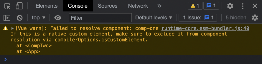
You see the following warning if you attempt to utilize CompOne.vue from within CompTwo.vue while the application is in development mode:
Slots in Vue
Vue’s slots are a strong feature that enable more adaptable and reusable components.
To transport material from the parent into the <template> of a child component, we utilize slots in Vue.
Slots
Thus far, we have only utilized elements within <template> as self-closing tags, such as this:
App.vue:
<template>
  <slot-comp />
</template>
Alternatively, we can utilize opening and closing tags and include some information, such as a text message:
App.vue:
<template>
  <slot-comp>Hello World!</slot-comp>
</template>
However, to get ‘Hello World! We must utilize the <slot> element inside the component in order to display it on our page. When the application is developed, the material provided to it will replace the <slot> element, which serves as a placeholder for the content.
Example
SlotComp.vue:
<template>
  <div>
    <p>SlotComp.vue</p>
    <slot></slot>
  </div>
</template>
Slots as Cards
In order to create a card-like appearance, slots can also be used to wrap around larger portions of dynamic HTML text.
We may now simply provide the HTML content inside the <slot> tag as is, instead of sending data as props to build content inside components like we did in the past.
Example
App.vue:
<template>
  <h3>Slots in Vue</h3>
  <p>We create card-like div boxes from the foods array.</p>
  <div id="wrapper">
    <slot-comp v-for="x in foods">
      <img v-bind:src="x.url">
      <h4>{{x.name}}</h4>
      <p>{{x.desc}}</p>
    </slot-comp>
  </div>
</template>
To give the content a card-like appearance without affecting other divs in our application, we utilize a div around the <slot> and style the <div> locally as the content enters the component where the <slot> is.
SlotComp.vue:
It is possible to reuse components that generate a card-like frame around content to construct different pieces while maintaining the same card-like frame.In this example, we design a footer using the same component as for the meal items.
Example
App.vue:
<template> <h3>Reusable Slot Cards</h3> <p>We create card-like div boxes from the foods array.</p> <p>We also create a card-like footer by reusing the same component.</p> <div id="wrapper"> <slot-comp v-for="x in foods"> <img v-bind:src="x.url"> <h4>{{x.name}}</h4> </slot-comp> </div> <footer> <slot-comp> <h4>Footer</h4> </slot-comp> </footer> </template>Content Fallback
We can provide fallback content in the <slot> if a component is built without any content.
Example
Since there is no content in the application’s first component, the fallback content is rendered.
App.vue:
<template> <h3>Slots Fallback Content</h3> <p>A component without content provided can have fallback content in the slot tag.</p> <slot-comp> <!-- Empty --> </slot-comp> <slot-comp> <h4>This content is provided from App.vue</h4> </slot-comp> </template>SlotComp.vue:
<template> <div> <slot> <h4>This is fallback content</h4> </slot> </div> </template>