We can construct a custom event in the child component that can be recorded in the parent element using Vue’s built-in $emit() method.
$emit() is used to convey information from the child component to the parent, whereas props are used to send data from the parent element to the child component.

Our next steps are intended to modify a food item’s “favorite” status in the parent App.vue rather than the FoodItem.vue child component, where the change is now taking place.
Our next steps are intended to modify a food item’s “favorite” status in the parent App.vue rather than the FoodItem.vue child component, where the change is now taking place.
The favorite status needs to be modified in App.vue since that is where it is initially saved, which is why it is changed there rather than in FoodItem.vue. In a more complex project, the data may originate from a database that we have connected to in App.vue. If we want a change to be made from the component to the database, we must notify the parent from the child component.
Vue Event Emission
In order to transmit data from the component to the parent, we utilize the built-in $emit() method.
When the toggle button is pressed, the toggleFavorite function within the FoodItem.vue component already executes. Let’s now add a line to emit our custom event “toggle-favorite” and remove the current one:
FoodItem.vue:
methods: {
  toggleFavorite() {
    this.foodIsFavorite = !this.foodIsFavorite;
    this.$emit('toggle-Favorite');
  }
}
Although we are free to define the name of our own event, emit events often utilize kebab-case.
Get an Emit Event
The FoodItem.vue component is now emitting the custom emit event “toggle-favorite,” but in order to verify that the event occurred, we must listen to it in the App.vue parent and invoke a function that takes action.
In App.vue, where the component is created, we listen to the event using the shortcut @ rather than v-on:
Example
Play the App.vue ‘toggle-favorite’ event:
<food-item
  v-for="x in foods"
  :key="x.name"
  :food-name="x.name"
  :food-desc="x.desc"
  :is-favorite="x.favorite"
  @toggle-favorite="receiveEmit"
/>
To recognize that our custom ‘toggle-favorite’ event has occurred, we must write the receiveEmit method in App.vue:
methods: {
  receiveEmit() {
    alert('Hello World!');
  }
}
Change The Food Item ‘favorite’ Status in The Parent
Now, when the ‘Favorite’ button is hit from the child component, an event is sent to alert App.vue.
When a ‘Favorite’ button is selected, we want to update the ‘favorite’ property in the ‘foods’ array in App.vue for the appropriate food item. Since each food item’s name is unique, we transmit it from FoodItem.vue to App.vue in order to accomplish that:
FoodItem.vue:
methods: {
  toggleFavorite() {
    this.$emit('toggle-favorite', this.foodName);
  }
}
Now, when the ‘toggle-favorite’ event occurs, we can get the name of the food item in App.vue as an argument to the method called, as shown here:
Example
App.vue:
methods: {
  receiveEmit(foodId) {
    alert( 'You clicked: ' + foodId );
  }
}
We can now update the ‘favorite’ state for the appropriate food item within the ‘foods’ array since we know which food item was clicked:
App.vue:
methods: {
  receiveEmit(foodId) {
    const foundFood = this.foods.find(
      food => food.name === foodId
    );
    foundFood.favorite = !foundFood.favorite;
  }
}
The array method ‘find’ in the code above searches the ‘foods’ array for an object whose name property matches the food item we clicked. It then returns that object as ‘foundFood’. Next, we may change ‘foundFood.health‘ to the reverse of its previous value, making it toggle between true and false.
Study up on the ‘find’ JavaScript array method.
Study up on the arrow functions in JavaScript.
The ‘favorite’ status of the correct dish is now updated within the ‘foods’ array. The only thing left to do is update the picture that represents your favorite dish.
We only need to refer to this ‘isFavorite’ prop in FoodItem.vue from v-show where the element is to change the image, as the food item components are already constructed with the ‘favorite’ state from the ‘foods’ array and sent as a prop ‘is-favorite’ from App.vue:
<img src="/img_quality.svg" v-show="isFavorite">Since the ‘foodIsFavorite’ data property in FoodItem.vue is no longer in use, we can likewise remove it.
Example
The favorite status of the food items can be toggled in the same manner as previously in this last sample code, but it is now changed inside App.vue.
The Option for “emits”
Using the Vue ’emits’ option, we can record what the FoodItem.vue component emits in the same manner that we define props inside the component.
While emits are only advised to be recorded, props must be defined in the component.
We can record our data in the FoodItem.vue component in this way:
<script>
export default {
  props: ['foodName','foodDesc','isFavorite'],
  emits: ['toggle-favorite'],
  methods: {
    toggleFavorite() {
      this.$emit('toggle-favorite', this.foodName);
    }
  }
};
</script>
Documenting the emissions makes it easy for others to utilize the component.
Attribute Fallthrough
It is possible to call a component with characteristics that aren’t stated as props; these attributes will just flow to the component’s root element.
Because fallthrough attributes eliminate the requirement to define the attribute as a prop, they simplify our code and provide a better overview from the parent where the component is built.
Class, style, and v-on are common characteristics that are employed to fall through.
For instance, it can be convenient to manage the component styling from the parent instead of having it tucked away inside the component.
To understand how the style attribute transfers to the components that represent tasks, let’s construct a new example, a simple to-do list in Vue.
Therefore, the list of tasks should be included in our App.vue along with a
element and a for adding new tasks. Every item on the list is a component of .
App.vue:
<template>
  <h3>Todo List</h3>
  <ul>
    <todo-item
      v-for="x in items"
      :key="x"
      :item-name="x"
    />
  </ul>
  <input v-model="newItem">
  <button @click="addItem">Add</button>
</template>

<script>
  export default {
    data() {
      return {
        newItem: '',
        items: ['Buy apples','Make pizza','Mow the lawn']
      };
    },
    methods: {
      addItem() {
        this.items.push(this.newItem),
        this.newItem = '';
      }
    }
  }
</script>
Additionally, TodoItem.vue simply gets the instructions as a prop:
TodoItem.vue:<template>
<li>{{ itemName }}</li>
</template>
<script>
export default {
props: ['itemName']
}
</script>We also require the proper main.js setting in order to properly construct our application:
main.js:
import { createApp } from 'vue'

import App from './App.vue'
import TodoItem from './components/TodoItem.vue'

const app = createApp(App)
app.component('todo-item', TodoItem)
app.mount('#app')
We can apply some styling to the list items from App.vue to show the significance of this section, which is that properties can fall through to the root element inside the <template> of our component.
Example
The <li> components inside the component are styled using App.vue:
<template>
  <h3>Todo List</h3>
  <ul>
    <todo-item
      v-for="x in items"
      :key="x"
      :item-name="x"
      style="background-color: lightgreen;"
    />
  </ul>
  <input v-model="newItem">
  <button @click="addItem">Add</button>
</template>
We can right-click a <li> element in our to-do list in the browser and select ‘Inspect’ to verify that the style attribute has truly fallen through. The style attribute is now visible on the <li> element:
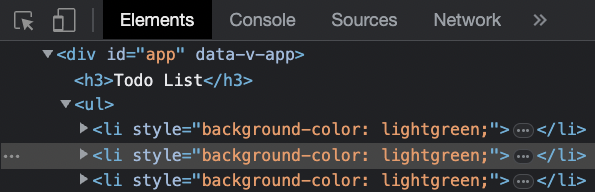
Combining Class and Style Attributes
The ‘class’ and ‘style’ properties will be combined if they are already set and if they are fallthrough attributes from the parent.
Example
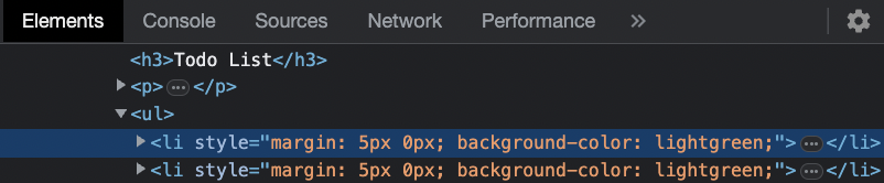
We provide the <li> elements inside the TodoItem.vue component a margin in addition to the parent’s pre-existing styling:
<template>
  <li style="margin: 5px 0;">{{ itemName }}</li>
</template>

<script>
  export default {
    props: ['itemName']
  }
</script>
The combined properties are visible when we right-click on a <li> element in the browser. The margin is applied directly to the <li> element within the component and combined with the parent’s background color:
$attrs
It becomes unclear which element the attributes should apply to if the component’s root level contains many elements.
We can use the built-in $attrs object to mark the element in order to specify which root element receives the fallthrough attributes, as shown here:
Example
TodoItem.vue:
<template>
  <div class="pinkBall"></div>
  <li v-bind="$attrs">{{ itemName }}</li>
  <div class="pinkBall"></div>
</template>